
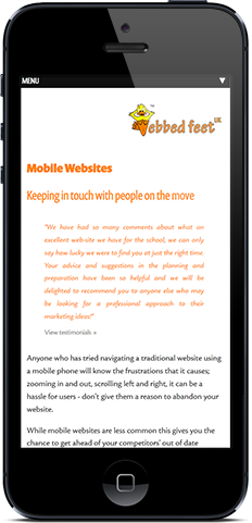
Mobile Websites
Keeping in touch with people on the move
Anyone who has tried navigating a traditional website using a mobile phone will know the frustrations that it causes; zooming in and out, scrolling left and right, it can be a hassle for users - don't give them a reason to abandon your website.
While mobile websites are less common this gives you the chance to get ahead of your competitors' out of date websites and pick up their traffic.
Mobile internet is set to overtake desktop internet usage [1] and, despite the mobile technology being available, the majority of websites don't cater for mobile devices.
Webbed Feet can create either an independent mobile website, or adapt your current design so that it responds better to smaller screen resolutions. The end result is a website that will look professional and be easy to use on any device, whether it be a desktop, laptop, tablet or smart phone.
A mobile or responsive website will provide mobile users with a fast and efficient route to becoming your customer.
[1] Source Microsoft Tag “By 2014, mobile internet should take over desktop internet usage” – BGR.com web browsing statistics.